FCX Performance Rebranding
FCX Performance is a nationally known process flow control company that provides technical expertise, products, and services to a wide range of industries and markets.
brand identity
logo design
web design
Logo
As the graphic design lead, I collaborated with a trusted partner to develop a new logo, merging my company insight with their branding expertise. I supplied historical company data, logo significance, competitor analysis research, and comments provided by the leadership team.
Together, we crafted a sleek logo featuring interconnecting lines resembling pipes, signifying precision and efficiency. Vibrant red and orange hues portray energy, reflecting the company's pursuit of excellence. Our bold, vibrant logo captures the essence of the company—a forward-thinking industrial leader, driven by passion and powered by energy.

Color Palette
Red and orange are both vibrant and energetic colors, each resembling power and energy. The pair is balanced with a deep navy blue which offers a sense of intelligence, trustworthiness, and stability.
Combining these colors reflects a dynamic blend of innovation, progress, and knowledge—capturing the essence of FCX Performance.

Secondary Colors
These colors can be used to create emphasis and interest; however, they should never overpower or replace the corporate logo colors.
Gradients
These gradients are used to help differentiate between categories and to emphasize important messages.


Typography
New Science Bold Extended
New Science is the typeface that is used for headings. This font is bold and geometric, which reflects strength and modernity—two key qualities within the overall branding strategy.
Open Sans
Open Sans is the typeface that is used for body copy. This font is known for its clean and modern appearance. Open Sans ensures that our content remains accessible and engaging, making it a reliable choice for our brand.


Imagery
Abstract Imagery
These should be incorporated mindfully, adhering to the brand’s color palette without detracting from the overall message or hero image. It is also important to note that patterns and textures should provide a subtle nod to the products or services we provide. Shown below are several examples of those for reference purposes.


Photography
High-quality photos are essential to maintain a professional image and build trust with our audience. We'll establish a recognizable visual identity through a consistent color palette and editing style. This creates a sense of unity across all platforms and strengthens brand recognition.


Marketing Resources
Here are examples that clearly demonstrate how the brand elements can be effectively utilized.
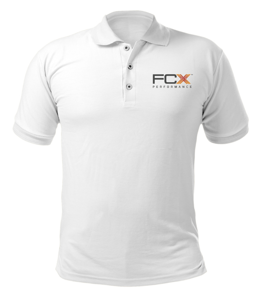
Branded Uniform
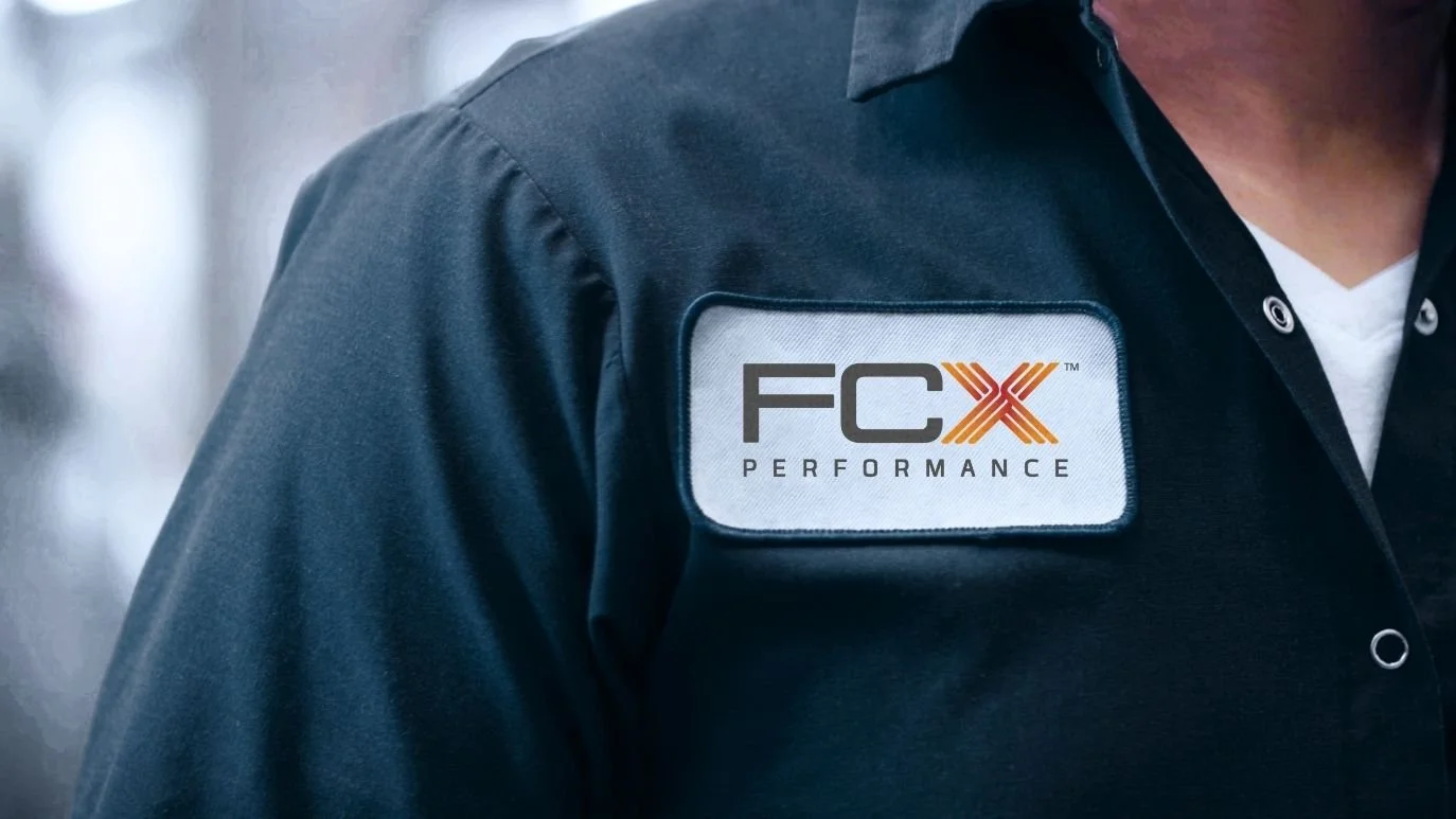
Employee Badge

FCX Performance Sticker
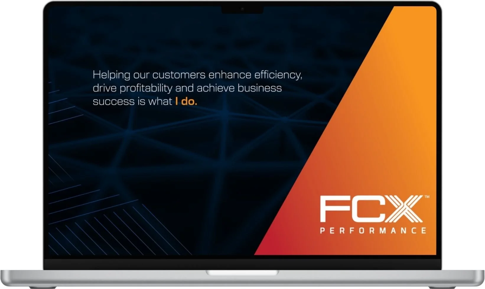
Desktop Screensaver

Presentation Slide

Business Cards
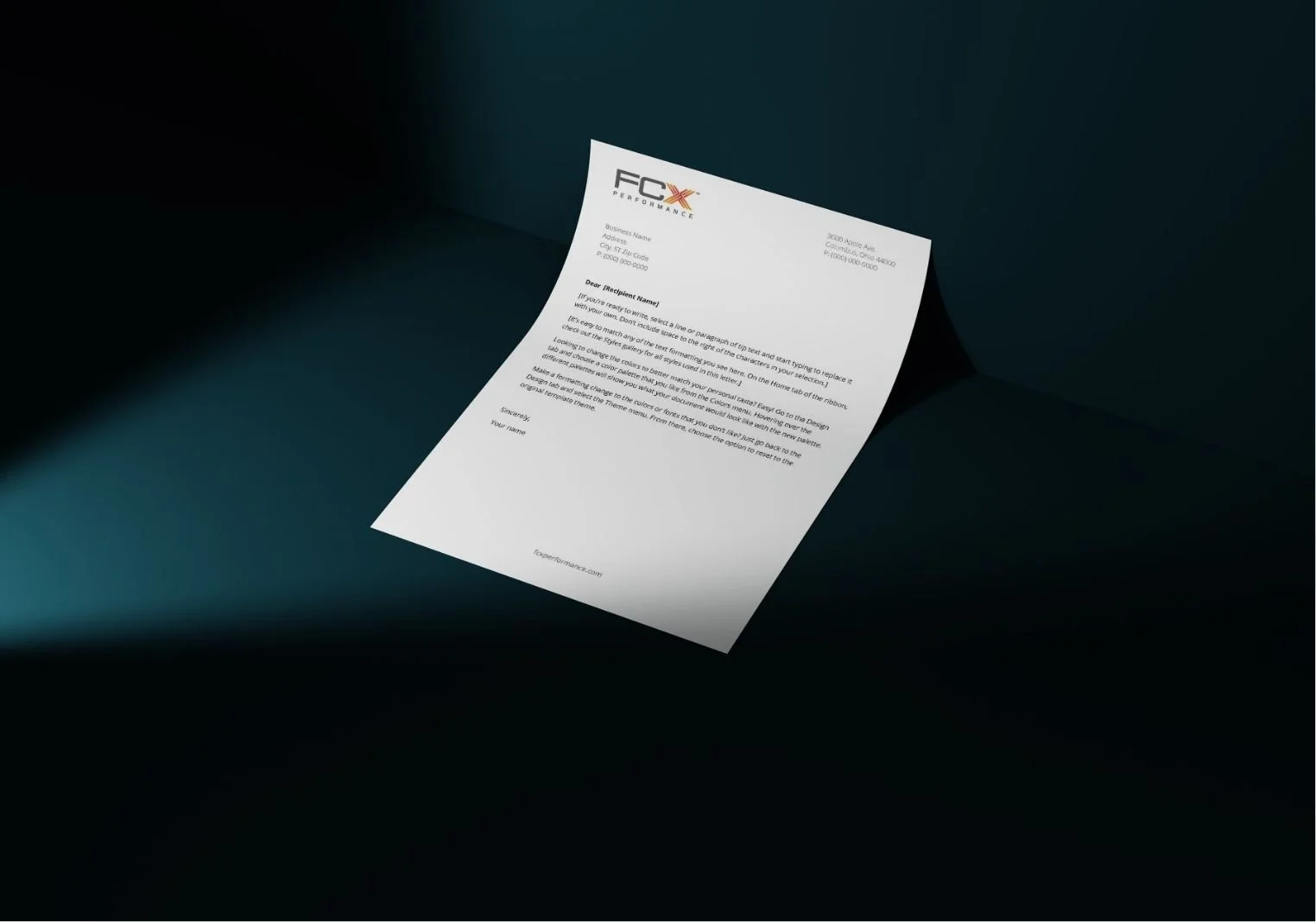
Company Letterhead
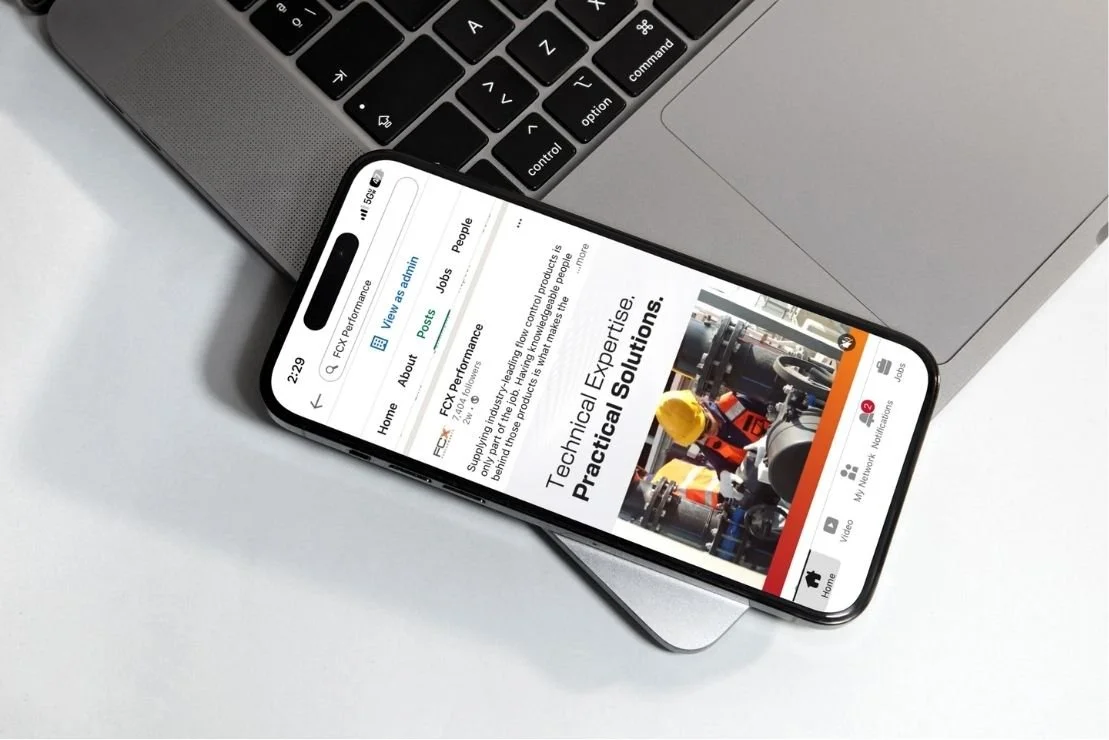
Company LinkedIn Profile

Social Post Template

LinkedIn Banner

Event Banner